Archives: Проекты
R1
VORONTSOVA HOME
-
Square
43.1 sq.m
-
Автор проекта:
Дмитрий Дубровский
-
Клиент:
Vorontsova
-
Место:
Санкт-Петербург, Невский пр., д. 48
-
Тип:
магазин
-
Проектирование:
2023
-
Строительство:
2023
-
Square
43.1 sq.m
-
Автор проекта:
Дмитрий Дубровский
-
Клиент:
Vorontsova
-
Место:
Санкт-Петербург, Невский пр., д. 48
-
Тип:
магазин
-
Проектирование:
2023
-
Строительство:
2023
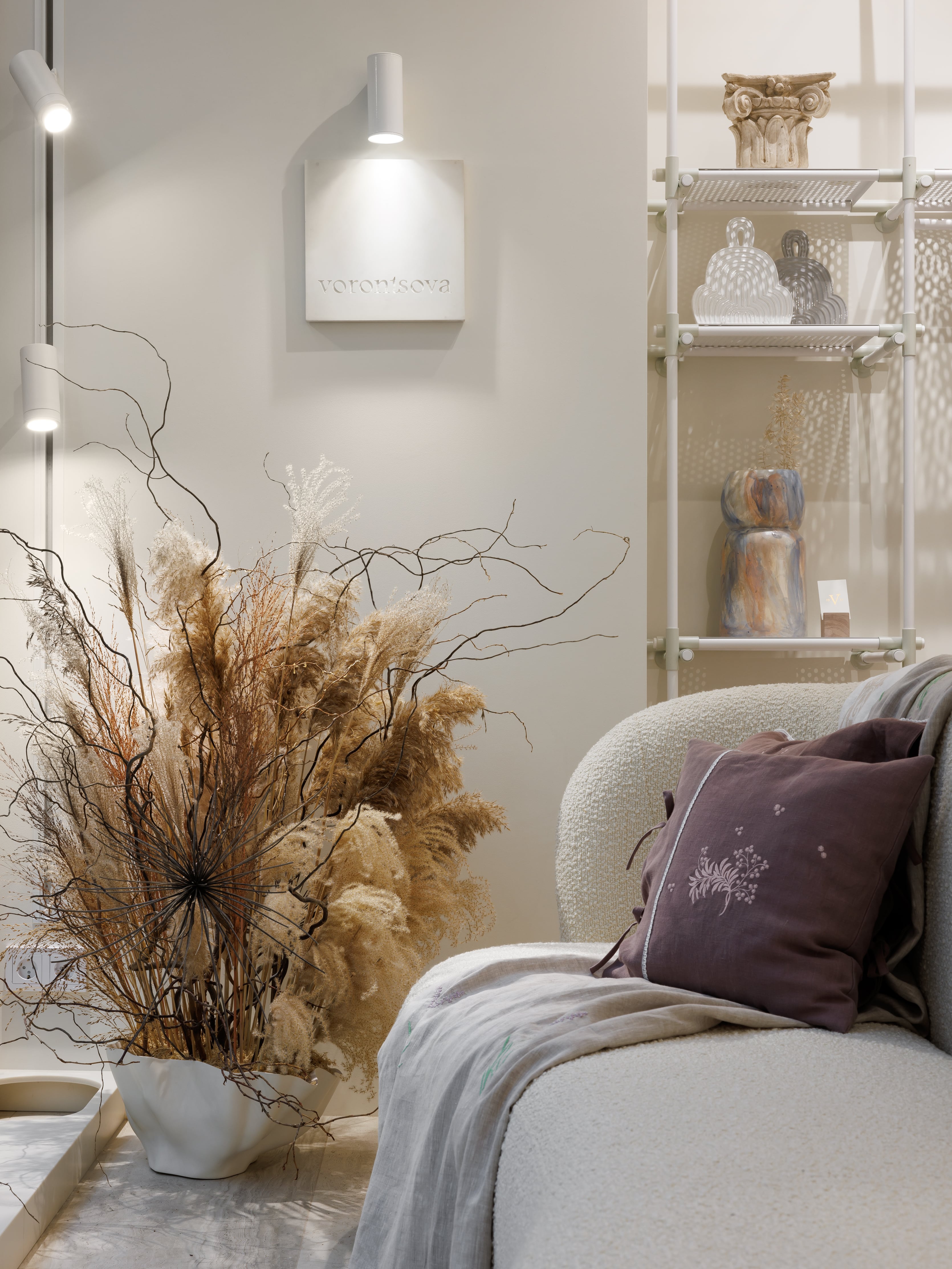
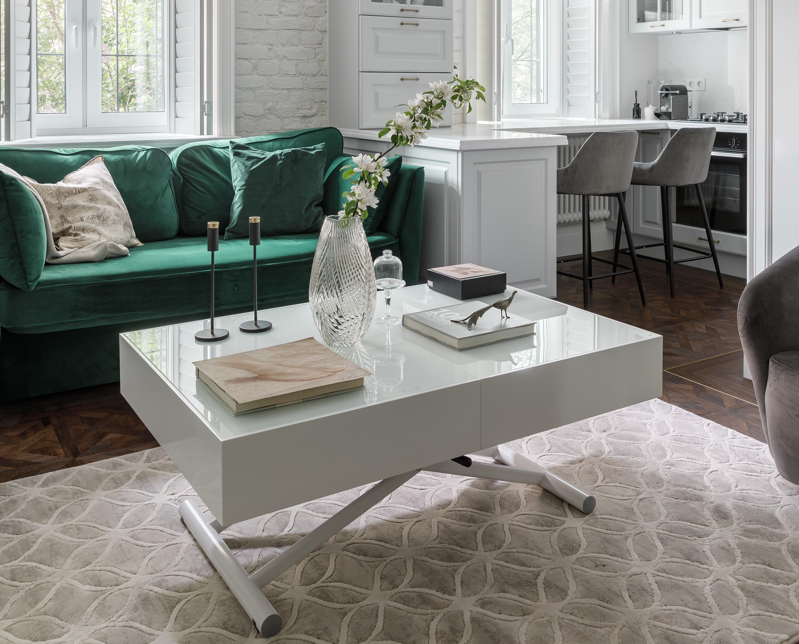
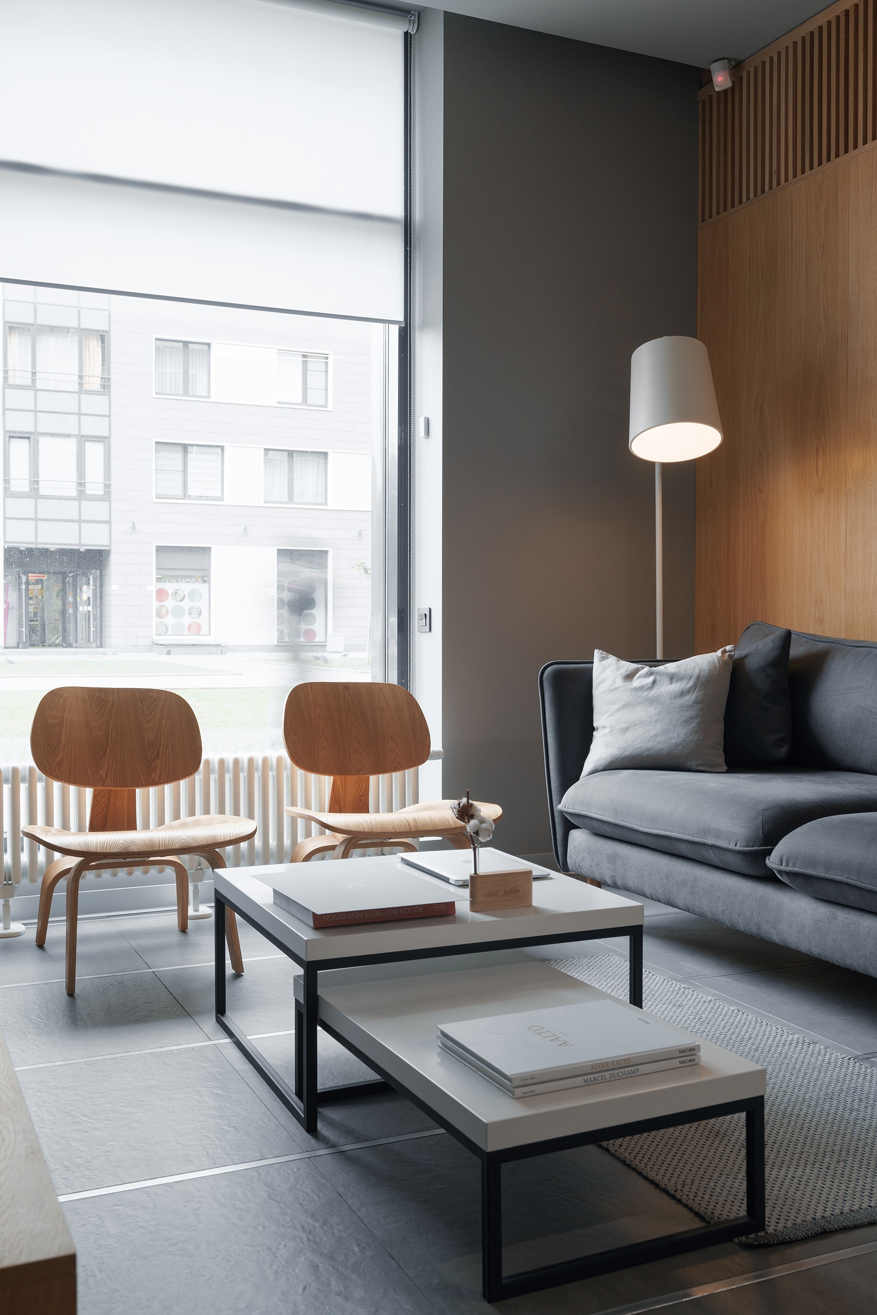
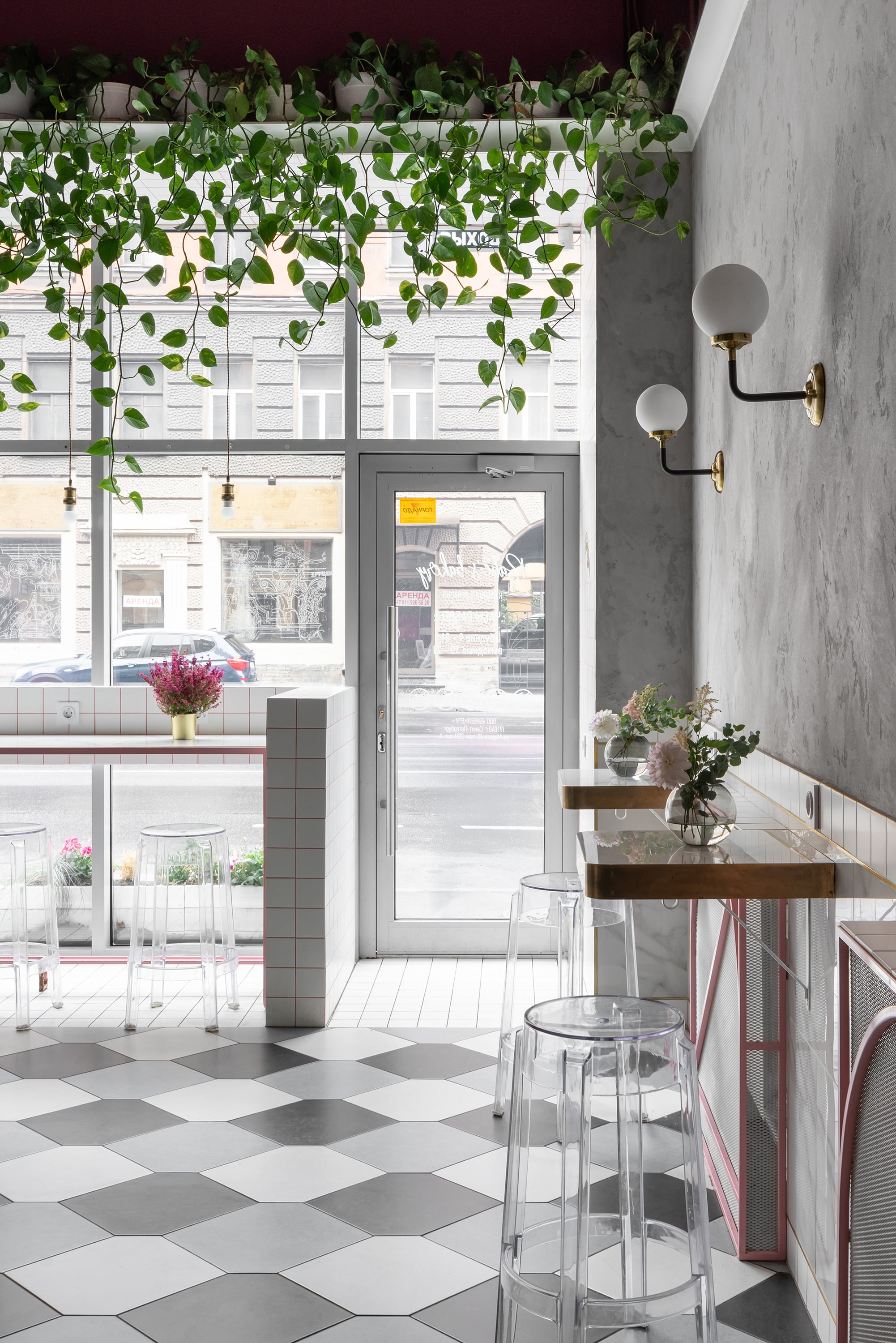
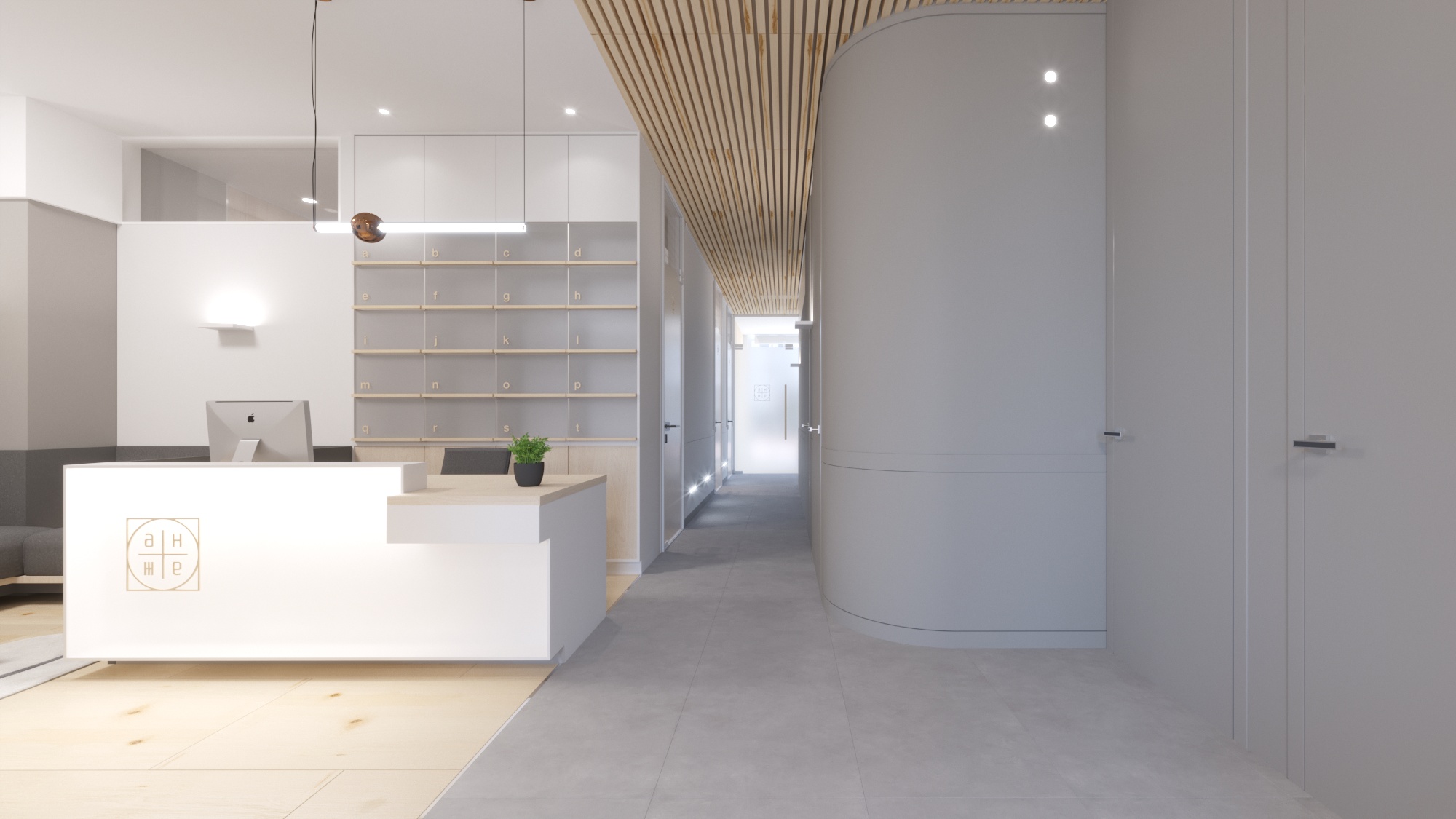
Нам предстояло спроектировать салон товаров для дома Vorontsova home, в котором представлены текстиль, керамика, стекло, эко-косметика и объекты предметного дизайна, созданные локальными русскоязычными авторами.
В частности в магазине представлен домашний текстиль от Vorontsova Home, выполненный по семейным традициям с собственным производством в Петербурге, авторские предметы от Levadnaja ceramics, Anna Zhukova, Kesler Maria, изделия из стекла от Solid Waters и Kirini, ковры от Arte de Vivre.
Салон находится в самом центре Санкт-Петербурга в известном историческом здании Пассажа, между Невским проспектом и Итальянской улицей.
Архитектурный контекст, с которым нам посчастливилось работать, имеет глубокую историю: постройка Пассажа была задумана в 1845 году как торговое здание нового для России типа, по примеру лондонских и парижских галерей.
Трехэтажное здание возведено в по проекту архитектора Р. А. Желязевича, главный фасад по Невскому проспекту выдержан в характере неоренессанса. Первый этаж раскрыт арочными проемами, два яруса обработаны пилястрами тосканского и композитного ордеров. Со стороны Итальянской улицы разместился концертный зал. Позже в основной, внутренней части были сооружены трехъярусные галереи со средним сквозным проходом, перекрытым световым фонарем. Здесь как бы зародилась «стеклянная архитектура» Петербурга XIX в. Галереи, включавшие 104 магазина, были соединены продольными балконами и двумя мостиками. Внутреннее устройство здания было устроено с применением новых материалов, например, искусственного мрамора и пегамоида. Полы в торговых помещениях изготовлены из метлахских плит, а в залах - паркетные.
Работа с интерпретацией исторической детали и сохранением духа места стала ведущим мотивом для будущего интерьера. Мы хотели, чтобы помещение салона стало органическим продолжением галереи променада Пассажа и будто деликатно следовало за его пространством, но имело современную форму. Так металлическая конструкция светового фонаря послужила источником вдохновения для модульной системы торгового оборудования, а для напольного покрытия мы использовали метлахскую плитку и травертин, напоминающие покрытия внутри галереи, слегка изменив структуру узора. Полукруглая форма полуколонн повторяется в завершениях ниш центрального участка, которым зонировано вытянутое в плане пространство.
Объем помещения условно разделен на три функциональных зоны: витрину, центральную зону с сервированным столом и местом для презентаций, в удаленной части находится прикассовая зона с островным столом-стеллажом.
Для того, чтобы салон запомнился посетителям мы спроектировали несколько символических объектов, так называемых attention grabbers: зону администратора мы отделили перегородкой из гипса, имитирующей драпировку, а над столовой группой разместили масштабный мобиль от mononoke, который находится в постоянном движении, изменяя свою форму.


O2
MARTIN TRAVEL
-
Square
55.8 sq.m
-
Design team:
Dmitry Dubrovsky
-
Client:
private individual
-
Location:
Saint-Petersburg, BC Grani
-
Type:
Offices
-
Design:
2020
-
Construction:
2020
-
Photo:
Ivan Sorokin
-
Square
55.8 sq.m
-
Design team:
Dmitry Dubrovsky
-
Client:
private individual
-
Location:
Saint-Petersburg, BC Grani
-
Type:
Offices
-
Design:
2020
-
Construction:
2020
-
Photo:
Ivan Sorokin
Facility
We designed this office for a travel company that plans business trips and corporate travel around the world. The premises chosen by the client are located in the Grani multifunctional complex on Bolshaya Zelenina Street.
The complex consists of two historical restored and reconstructed buildings from the XIX-XX centuries and a new modern building. This is where the future interior is located.
Planning solutions
A simple and open layout is the ideal way to fill the office with air and light. The space is very delicately zoned with glass partitions and perforated metal panels.
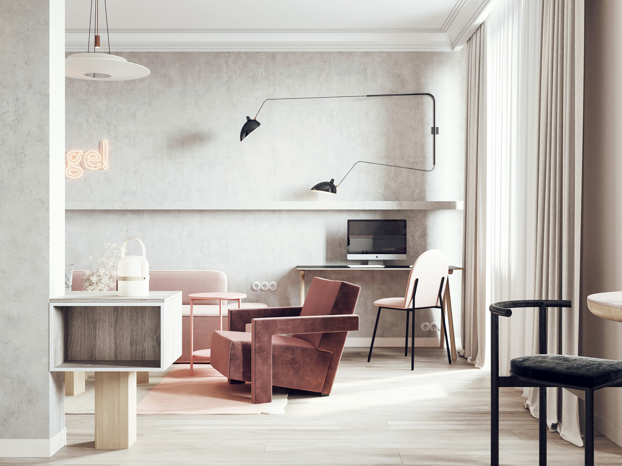
In the zone of managers' work there are three tables in island mode, a few chairs for visitors and a multifunctional cabinet with a shelf, in which the necessary appliances are concentrated.
Only the managers' area is separated into a separate room separated by a glass partition adjacent to the shelving unit, which creates additional soundproofing.
The area at the entrance of the office was decided to be used for rest and presentations.
Finishing
We have tried to incorporate into the interior the materials that already existed prior to our work, making use of their decorative possibilities. For example, we left the surface of the concrete façade wall untouched, and coated it with a dust-free varnish. And the expanded clay aggregate blocks, of which the partition was made, we painted them with white paint and illuminated them. The section of concrete ceiling with exposed exposed wiring was also left untouched.
The interior turned out to be monochrome and very restrained.
A soft pearl-gray color scheme is supplemented by point lamps and sconces with a graphic base in black powder coating, metal tables and carts, and black and white posters in the spirit of the Bauhaus school. Such a palette made it possible to emphasize forms and rhythms, textures and important details. And to keep the interior from being perceived as cold, we added natural oak surfaces, which can be found in the curved backs of chairs, cabinet furniture and window frames.
AP15
RC UNIVERSE
-
Square
130.1 sq.m
-
Design team:
Dmitry Dubrovsky
-
Client:
private individual
-
Location:
Saint-Petersburg, RC Universe
-
Type:
Apartment
-
Design:
2020-2021
-
Construction:
2021
-
3D-visual
Vyacheslav Korchagin
-
Square
130.1 sq.m
-
Design team:
Dmitry Dubrovsky
-
Client:
private individual
-
Location:
Saint-Petersburg, RC Universe
-
Type:
Apartment
-
Design:
2020-2021
-
Construction:
2021
-
3D-visual
Vyacheslav Korchagin
The apartment we had to work on the interior of is located in St. Petersburg, in the center of the Petrogradskaya Storona, not far from Austrian Square. From these places, near the Peter and Paul Fortress, St. Petersburg began to develop. The district developed along with the city, becoming a center of cultural, scientific and secular life.
The developer describes the style of the building as light Art Deco. Indispensable elements of the building's architecture are the French balconies, pilasters, and the natural stone and fine ceramic tile cladding.
The laconic, close to classic architecture combined with original architectural details is neatly integrated into the context of the historic building.
For this reason, we decided to design an interior that will be a harmonious continuation of the exterior of the house and will exist in it in an organic architectural ensemble without separating it from the present time and current interior trends.
So in the basis of the author's technique was the transfer of the motifs of the facade and the environment in a few elements of the interior decor. In the plaster, which forms the headboard in the bedroom, we have repeated the pattern of the grating of the balcony railings. And for the wall cladding behind the shelving units we have used tiles similar to those we can see on the facade of the house.
The rest of the interior is quite laconic and architectural. The volumes, in which the guest bathroom and laundry room are located, were highlighted with different materials: veneered oak panels and fine decorative plaster with marble chips.
The architectural details were based on the study of the junctions between the various elements. We solved the conjugation of the wall and ceiling with a shadowed joint, and the walls and floor with a concealed skirting board with different types of finish depending on the functional purpose.
AP25
PALEVSKY HOUSING ESTATE
-
Square
55 sq.m
-
Design team:
Dmitry Dubrovsky
-
Client:
private individual
-
Location:
Saint-Petersburg, Palevsky Housing Estate
-
Type:
Apartment
-
Design:
2019
-
Construction:
2019-2020
-
Photo:
Ivan Sorokin
-
Style:
Dmitry Dubrovsky, Kseniia Valdman
-
Square
55 sq.m
-
Design team:
Dmitry Dubrovsky
-
Client:
private individual
-
Location:
Saint-Petersburg, Palevsky Housing Estate
-
Type:
Apartment
-
Design:
2019
-
Construction:
2019-2020
-
Photo:
Ivan Sorokin
-
Style:
Dmitry Dubrovsky, Kseniia Valdman
Customers of this interior were born in Russia, but in the early 90's moved first to Estonia, and then to Canada, where they live permanently until now. The apartment was inherited from their grandmother and is intended for their daughter, who loved St. Petersburg, and wants to spend part of her time here.
The apartment is located in Palevsky housing estate, one of the first such projects in Leningrad, built in 1925-1926, located between Elizarov Avenue and Olga Berggolts Street. The houses of the housing estate were grouped around five green courtyards. In the center of the complex there was a square with paths and a fountain. The idea of a garden-city was realized in the project, low-rise houses of the block type, rare for the city, were used. Their peculiarity is the direct connection of the apartments with the adjacent plots. At present the ensemble is an object of historical and cultural heritage and is under state protection.
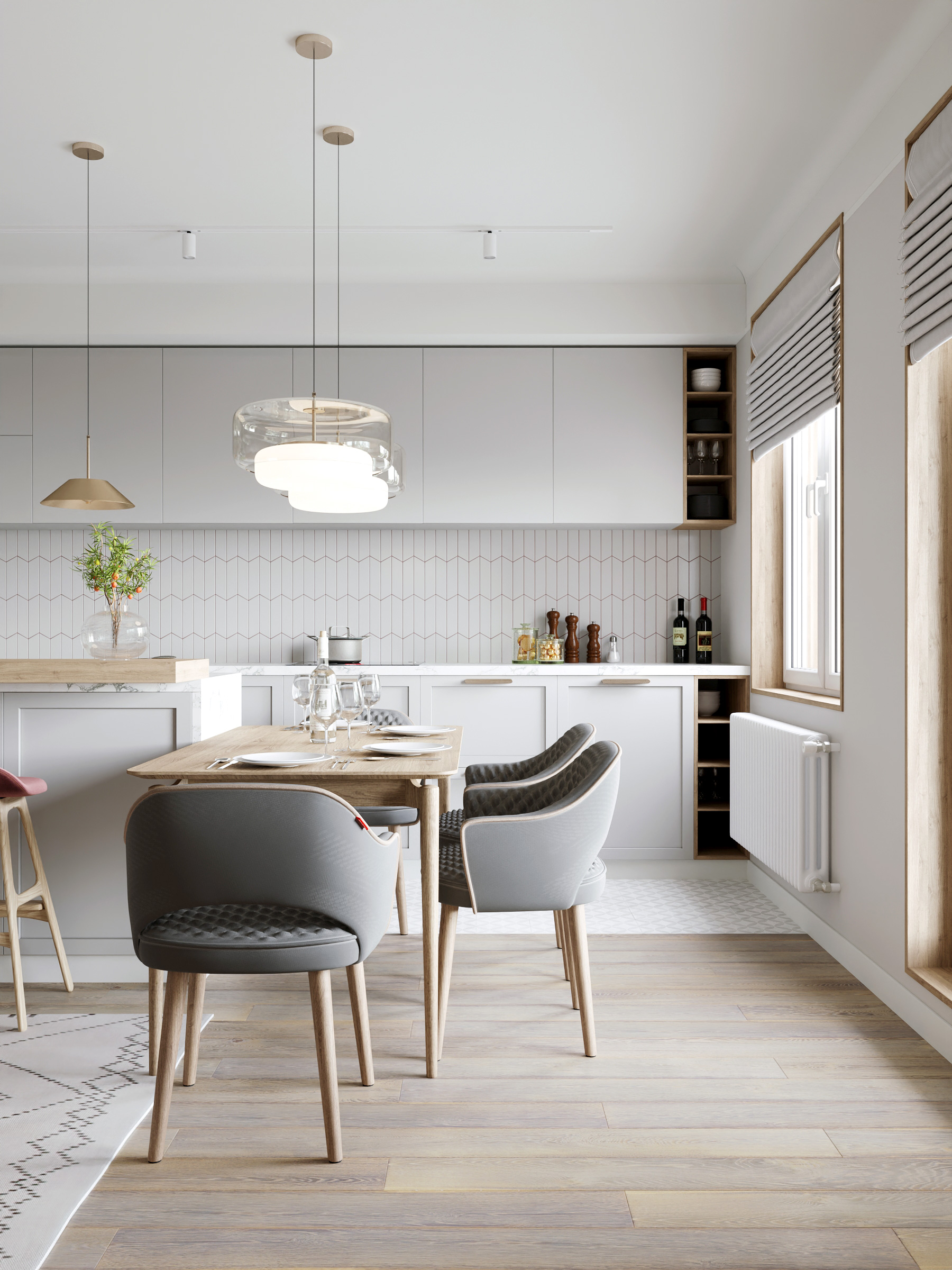
On an area of only 55 square meters we have two bedrooms, two bathrooms and a living room-kitchen, in which the owners spend most of their time. Due to the small size, most solutions are based on the principle of economical use of space. For example, as the main place for breakfast and dinner, we suggested using the kitchen worktop area integrated with a window sill and combined with a peninsula, separating the living room area from the kitchen
And for reception, we bought a transformable table with three positions. In the usual position it is a coffee table that can change its height, and in the unfolded position - a dining table that can accommodate up to six people.
In the bathroom there is a spacious shower separated by a partition in black metal strapping, and the guest bathroom is combined with the laundry room.
The storage systems in the bedrooms frame the openings, which also saves space.
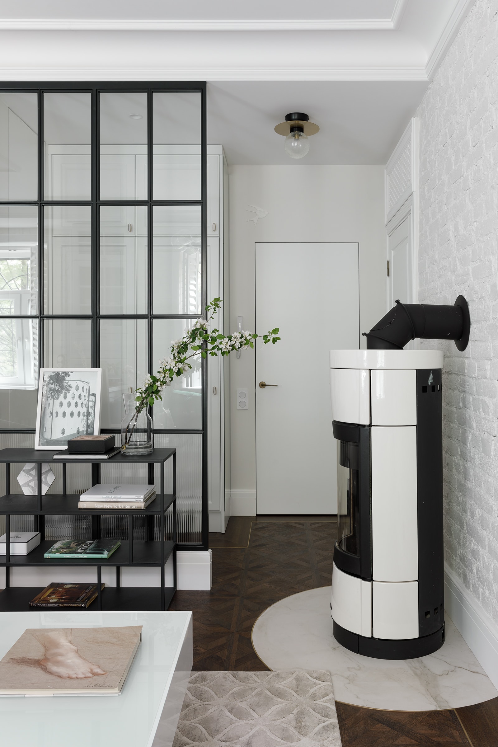
In the case of the old foundation, it was logical to use the potential that the room had before our intervention.
The first thing we did was to clean and restore the existing historical brickwork, аs well as to clean and corrugate the chimney and install a Nordica rotary stove. In the drawing of window grilles (the apartment is on the ground floor) we repeated the motive for the fence of the Palevsky housing estate, thus emphasizing respect for the history of the ensemble, supported it with graphics of lamps and rhymed it with translucent grilles separating the entrance hall from the living room. On the windows from the interior side shutters were installed - shutter folding lattices with swivel blades, which allow you to hide from prying eyes. And used in the decoration of cornices and moldings, which are more typical for homes in North America, familiar to the eyes of the owners.
AP81
SUVOROVSKY Av.
-
Square
98.5 sq.m
-
Design team:
Dmitry Dubrovsky
-
Client:
private individual
-
Location:
Saint-Petersburg, Suvorovsky Avenue
-
Type:
Apartment
-
Design:
2020
-
Construction:
2020
-
3D-visual
Vyacheslav Korchagin
-
Retouche
Dmitry Dubrovsky
-
Square
98.5 sq.m
-
Design team:
Dmitry Dubrovsky
-
Client:
private individual
-
Location:
Saint-Petersburg, Suvorovsky Avenue
-
Type:
Apartment
-
Design:
2020
-
Construction:
2020
-
3D-visual
Vyacheslav Korchagin
-
Retouche
Dmitry Dubrovsky
The apartment is located in the center of St. Petersburg on Suvorovsky Prospekt. The house is in the style of Neoclassicism with Empire elements, laid out in the year of Stalin's death and designed for the militarians. It was built by order of the General Staff of the Leningrad Military District on the territory belonging to the Nikolaev Military Hospital. The chapel of the hospital is located at the rear facade of the house. It is interesting to note that architect Asis Safovich Urazov was again called up to the Armed Forces in 1953 specifically to design and construct this building. For this purpose, he was appointed head of the architectural department of the VoenProekt Institute.
The apartment has a view of Degtyarny Lane and Nevsky City Hall building on one side and Suvorovsky Prospekt on the other (from the bedroom).
The customers are a family of doctors. The husband is a psychoanalyst, who was educated in France, in Paris, and has spent part of his time there ever since. This is why we have tried to structure the image of the interior so that it brings back memories of his favourite city.
Planning solution
The object has a planning structure typical of the architecture of the Stalinist period. The house has been built of brick with a wall construction system, so the rooms have windows on two facades separated by a load-bearing wall.
We decided to interfere with the existing layout as little as possible and leave the rooms in the size of the current rooms.
We divided the area of the apartment into three functional zones: the living room-kitchen, in the same block there is a bathroom, the children's area with a pantry, and a bedroom-closet. Along the load-bearing wall, going towards the living rooms, we built the main visual axis. The family reads a lot and the owners had a large collection of literature for which they asked for space.
So a library appeared at the end of the hallway, which we integrated as a color accent at the end of the room.
In order to visually reduce the length of the corridor, we divided it into two parts with a transom: a conventional hallway zone and a hallway. Similar constructions were used in the bathroom and kitchen-living room in order to level out the "jumping" height marks and build a clear system of vertical proportions.
The living room overlooks the kitchen. Even though our clients love to cook, we wanted this space to be unified for the sake of airiness and lots of natural light.
In the kitchen, we integrated the kitchen countertop into the window sill and arranged the seating on half-bar stools. You can have breakfast, a cup of coffee or a glass of wine over it. The kitchen furniture was also decorated with an accent color spot.
Finishing
The apartment has breathtaking panoramic views of the center of St. Petersburg. They were the starting point for designing the visual image of the future interior design.
The second basic component for shaping the design was the context.
In our case this is the architecture of the Stalinist period. Inspired by this, we came up with a system of transoms and portals, as elements separating the different functional volumes.
The shade of blue we have chosen for the accents is often used in France, and particularly in Paris, to color elements of the urban environment, for example the doors. In rhyme with this we chose acrylic stone with a texture reminiscent of travertine, which can often be seen on the facades of Parisian houses. To solve the rooms with vertically elongated proportions we developed a horizontal system of partitioning with decorative elements: a high plinth and a molding duplicating it.
The moldings are the same as those we see in the parade rooms and on the facades in the exterior of the building where the apartment is located - we simply transferred them from the exterior to the interior.
H1
HOUSTON DENTAL
-
Square
173.5 sq.m
-
Design team:
Dmitry Dubrovsky
-
Client:
Houston Dental
-
Location:
Kremenchugskaya 9, k. 2, Saint-Petersburg, Russia
-
Type:
Healthcare, Dental Clinic
-
Design:
2017
-
Photo:
Daniil Zherdev
-
Style:
Dmitry Dubrovsky, Kseniia Valdman
-
Square
173.5 sq.m
-
Design team:
Dmitry Dubrovsky
-
Client:
Houston Dental
-
Location:
Kremenchugskaya 9, k. 2, Saint-Petersburg, Russia
-
Type:
Healthcare, Dental Clinic
-
Design:
2017
-
Photo:
Daniil Zherdev
-
Style:
Dmitry Dubrovsky, Kseniia Valdman
Facility
A team of young businessmen contacted our bureau. They wanted us to design the interior for a dental clinic, focused on dental surgery and complex surgical operations.
Corporate design developed by Super Studio branding agency conditioned the minimalism aesthetics, restrained expressive means, and laconic architectural approach. Modular grids and geometric patterns alluded to the name provided by the customers, Houston Dental Design. Houston downtown sky-line provided us inspiration for the spatial concept.
Interior
The facility is located in downtown St. Petersburg, in the residential complex Tsarskaya Stolitza (Tzar’s Capital), in Kremenchugskaya Street.
Free layout of the commercial premise allowed for creating comfortable logistics with adherence to building and sanitary rules and standards.
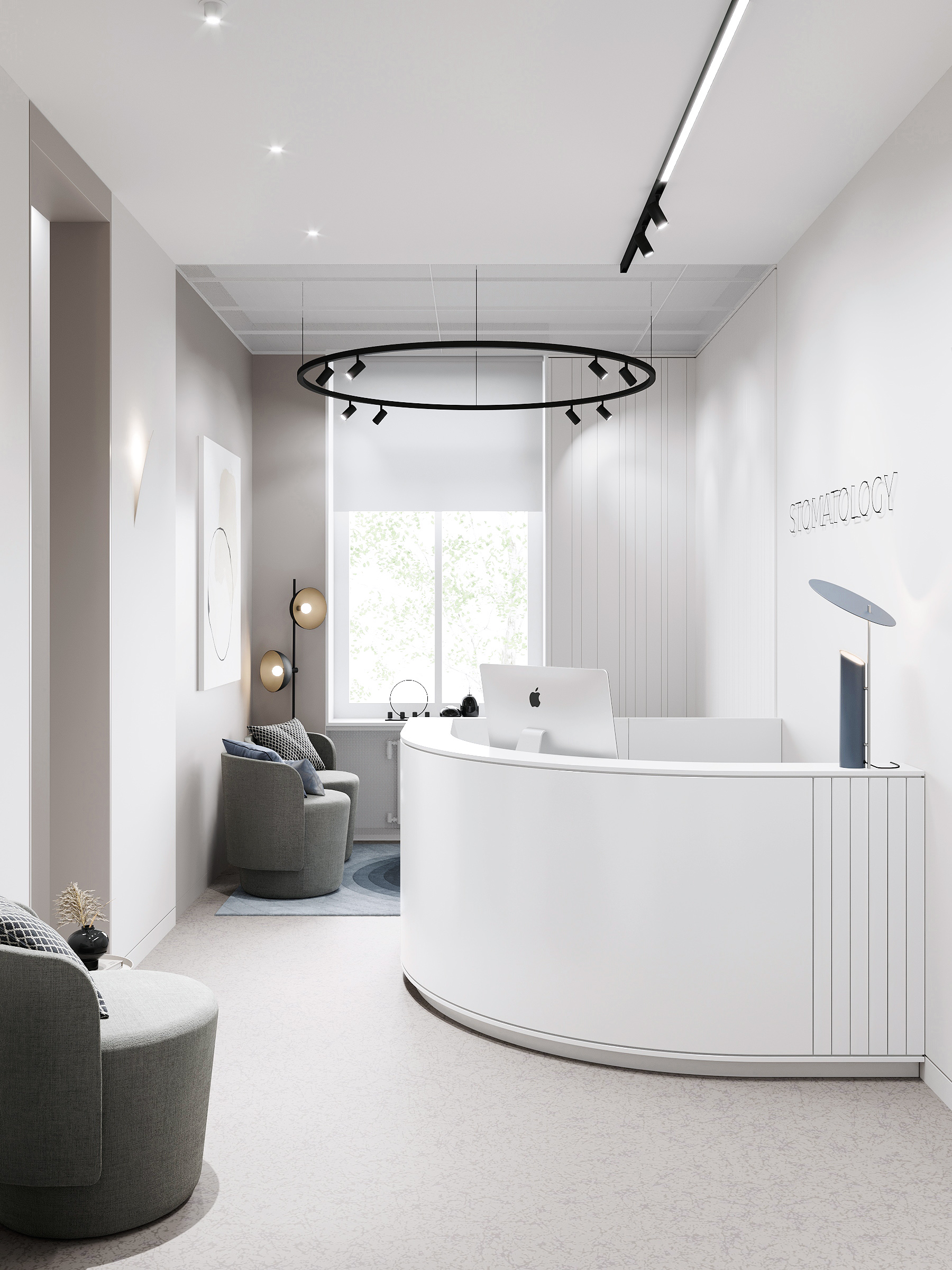
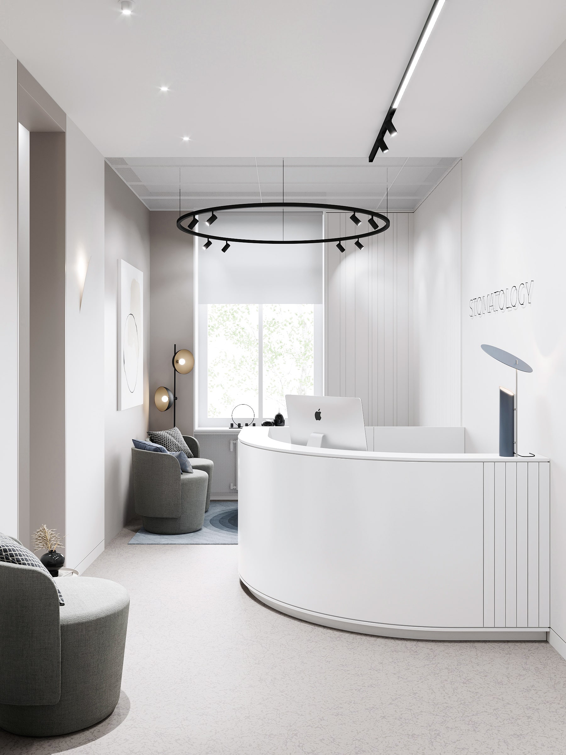
The dental clinic premises were divided into three functional areas: a customer area, a staff area, and medical rooms. The main design challenge was that there was only one entrance to be used both by staff and patients.
Planning solutions
To divide flows of visitors, we placed information graphics against the entrance, as well as wear-proof painted direction marks on the floor, also repeated by wall signs. Moreover, we highlighted the entrance to staff area with a different color and a light frame: a thin aluminum profile with LED strips, running over the ceiling, both walls, and the floor. We used the same know-how to highlight the waiting area and the conference room.
The customer area is divided into several zones, namely: the reception desk with the contact place and the administrator’s work zone against a record cabinet where medical records are stored. The waiting area includes two sitting options and a credenza with a self-service coffee-point and media equipment. The reception zone is adjoined by a conference room with a glass gradient partition made by ceramic printing. This is a place to hold internal meetings and discuss treatment plans with patients. It is worth paying attention to the photo studio, as the clinic intends to collect before-and-after cases.
Finishing solutions
When it came to choosing finishing materials, we followed the minimalistic principle of three – concrete, oak, and glass against neutral backgrounds. Wherever engineering utilities were to be located accessible for operation, we used Ecofon removable module ceilings with panels of 1,200 by 600 mm and open longitude profiles, running towards the medical rooms.
H4
SMILE DESIGN CLINIC
-
Square
143.5 sq.m
-
Design team:
Dmitry Dubrovsky
-
Client:
Smile Design Clinic
-
Location:
Saint-Petersburg, Kushelevskaya dor., b.3, k.1
-
Type:
dental clinic
-
Design:
2020
-
Construction:
2020
-
Square
143.5 sq.m
-
Design team:
Dmitry Dubrovsky
-
Client:
Smile Design Clinic
-
Location:
Saint-Petersburg, Kushelevskaya dor., b.3, k.1
-
Type:
dental clinic
-
Design:
2020
-
Construction:
2020
We were approached by a young team of dentists with the task of designing the interior of a new digital clinic for them.
The main task that the customers have set us is to help them move into a new market segment, improving the quality of the interior and services and as a consequence attract more wealthy category of customers. We suggested the clients to create an image of the interior, which would relate the guest to a spa hotel rather than a medical facility.
Planning solution
The clinic has two entrances: one for the staff, and one for patients. This way, we were able to create convenient logistics and ensure that the flows do not interfere with each other.
We also managed to establish three clearly defined functional areas: a waiting area with an administrator's desk and ancillary rooms, a treatment zone that includes dental offices, an x-ray room, and a conference room where doctors discuss treatment plans with patients. The third zone is the technology zone, which contains the clinic's "kitchen", rooms for the storage of medical materials, sterilization room, temporary storage of waste and the resident's room, where doctors and their assistants spend time between patients' appointments.
Work on the project was carried out in collaboration with our clients, so each area is not only comfortable and accurately structured, but also has high quality in terms of medical technology. Also, each room was equipped with a photo studio with a system of backgrounds and lighting devices on pantographs, in order to collect professional treatment cases.
Finishing materials
We have used a palette of American walnut, terazzo grey, whiskey-coloured leather and suit fabrics to upholster the freestanding furniture, armchairs, sofas and chairs.
Where there is engineering equipment that needs to be accessed for operation, we planned a system of slatted ceilings. This way we removed ventilation system diffusers, germicidal recirculators and fire detectors from the visible space without violating sanitary standards.
H5
MEDSYSTEMS
-
Square
222 sq.m
-
Автор проекта:
Ирина Шестопалова, Дмитрий Дубровский
-
Клиент:
ООО МедСистема
-
Место:
пр. Строителей, д. 19
-
Тип:
стоматологическая клиника
-
Проектирование:
2022
-
Строительство:
2022-2023
-
Фото:
Даниил Жердев
-
Фирменный стиль:
Aga Agency
-
Square
222 sq.m
-
Автор проекта:
Ирина Шестопалова, Дмитрий Дубровский
-
Клиент:
ООО МедСистема
-
Место:
пр. Строителей, д. 19
-
Тип:
стоматологическая клиника
-
Проектирование:
2022
-
Строительство:
2022-2023
-
Фото:
Даниил Жердев
-
Фирменный стиль:
Aga Agency
Владельцы клиники сохраняющей стоматологии МедСистема обратились в нашу студии для проектирования нового объекта существующей сети на этапе выбора помещения для аренды. С нашей точки зрения - это верный подход, который позволяет заранее оценить соответствует ли планировочная структура тем видам деятельности, которые выбрал клиент. В итоге, заказчики совместно с нами остановились на помещении, которое находится в ближайшем пригороде Санкт-Петербурга, на проспекте Строителей в здании торгового центра Steit.
Здание отведено под общественные функции. В качестве исходных данных нам досталось универсальное пространство со свободной планировкой, и двухсторонним световым фронтом с витринным остеклением большой площади.
Было важно сохранить стилистику и цветовую гамму предыдущих проектов, чтобы постоянные клиенты ощущали преемственность и в то же время считывали новый подход к интерьеру и свежий взгляд на него. Над графической коммуникацией в рамках нового интерьера работали наши партнеры. Они освежили логотип, разработали уникальный паттерн, который выступает интерьерной декорацией, и систему навигации по клинике.
В начале работы мы отталкиваемся от архитектуры здания или окружения, так мы определяем отправные точки. Работая над объектом с коридорной системой, которая часто возникает в медицинской типологии, невольно сталкиваемся с двумя трудностями: естественным освещением замкнутого пространства коридора и его эстетическим решением. В нашем случае наполнили его светом при помощи матовых стеклянных перегородок, отделяющих кабинеты, которые находятся вдоль световых фронтов.
И дополнительно оформили объемы при помощи “супер-графики” - паттернов и иконок. В стеклянные перегородки установлены двери из шпонированного МДФ, - этот узел, пожалуй, оказался самым сложным в реализации и требовал координации подрядчиков между собой.
Интерьер построен формально и структурно: на фоне из повторяющегося ритма реек, линейных светильников, черной графики окон и стеклянных перегородок лежат геометрические объемы из натуральных материалов. В качестве акцента мы выбрали фирменный зеленый оттенок, который отвечает за преемственность и узнаваемость бренда. Но мы работали с ним не “в лоб”, а деликатно разнообразили набор приемов: использовали градиенты, декоративные наволочки с акварельным рисунком, роспись и постеры с тонкой графикой. На их фоне разместили объекты предметного дизайна из натуральных материалов: на фоне градиента - стойку из цельного слэба карагача и кофе-поинт из ореха. Функции кабинетов также прокодировали при помощи материалов. В терапевтических и хирургических кабинетах мебель выполнена из шпона ореха, а в детских кабинетах из шпона дуба.
Выделяющимся из концепции помещением получился рентген-кабинет. За яркой зеленой дверью находится выход в космос. Звездное небо, реалистичное изображение Юпитера, металлические элементы в рабочей мебели и холодная подсветка переносят в другой мир. Контраст с интерьером клиники вызывает у посетителей удивление и восторг, особенно у самых маленьких гостей.
C1
BABE'S BAKERY
-
Square
45.2 sq.m
-
Design team:
Dmitry Dubrovsky
-
Client:
Babe's bakey
-
Location:
Marata Str. 30, Saint-Petersburg, Russia
-
Type:
Horeca, Bakery
-
Design:
2017
-
Construction:
2018
-
Photo:
Dmitry Tsyrenshchikov
-
Style:
Kseniia Valdman
-
Retouch:
Sergey Brezhnev
-
Square
45.2 sq.m
-
Design team:
Dmitry Dubrovsky
-
Client:
Babe's bakey
-
Location:
Marata Str. 30, Saint-Petersburg, Russia
-
Type:
Horeca, Bakery
-
Design:
2017
-
Construction:
2018
-
Photo:
Dmitry Tsyrenshchikov
-
Style:
Kseniia Valdman
-
Retouch:
Sergey Brezhnev
Facility
The café for which we created interior design is located at Marata Street in the very heart of St. Petersburg.
Three young ladies who own the place have already worked together in catering. They decided to bring their dream to life and open a cozy café, serving delicious breakfasts and coffee at any time of the day.
A friend helped them with the brand style. The color palette comprised tenderly pink and olive, and the name – Babe’s bakery – was given with regular lettering.
Interior
Initially, this room had a large glass window, representing the connection of the interior with the city and the architectural environment. We used it to place a counter along the façade for visitors to enjoy the street view. Under the counter, three transparent semi bar chairs are hidden that don’t block view from the outside. The height of chairs wasn’t chosen by chance: baker’s shops are often attended by elderly people.
Deep window jambs are finished with white matte tiles and vividly pink grout. White surfaces reflect and enhance natural light and highlight the counter. The same tiling was used at the shop sign and the outside threshold.
The extended lounge was divided into two reasonable zones: a café zone with seats for visitors, and an ordering counter with a coffee machine, a fancy cakes display, and a tray for baked pastry.
Visually, the design was based on a fine combination of two background materials: marble and microcement. They have similar pattern, but different textures. The backgrounds were complemented with brass details and pieces made of welded square tubes. Tubes painted in the brand pink were used to make bracket-supported tables, room heater screens, bread baskets, and shelves for packing containers.
R1
MAMA ROMA
-
Square
149.5 sq.m
-
Design team:
Dmitry Dubrovsky, Sergey Ugarov
-
Client:
Bergamo LLC
-
Location:
Navaginskaya Str., Sochi, Russia
-
Type:
Horeca, Restaurant
-
Design:
2019
-
Construction:
2019
-
Photo:
Dmitry Dubrovsky
-
Retouch:
Sergey Brezhnev
-
Square
149.5 sq.m
-
Design team:
Dmitry Dubrovsky, Sergey Ugarov
-
Client:
Bergamo LLC
-
Location:
Navaginskaya Str., Sochi, Russia
-
Type:
Horeca, Restaurant
-
Design:
2019
-
Construction:
2019
-
Photo:
Dmitry Dubrovsky
-
Retouch:
Sergey Brezhnev
Facility
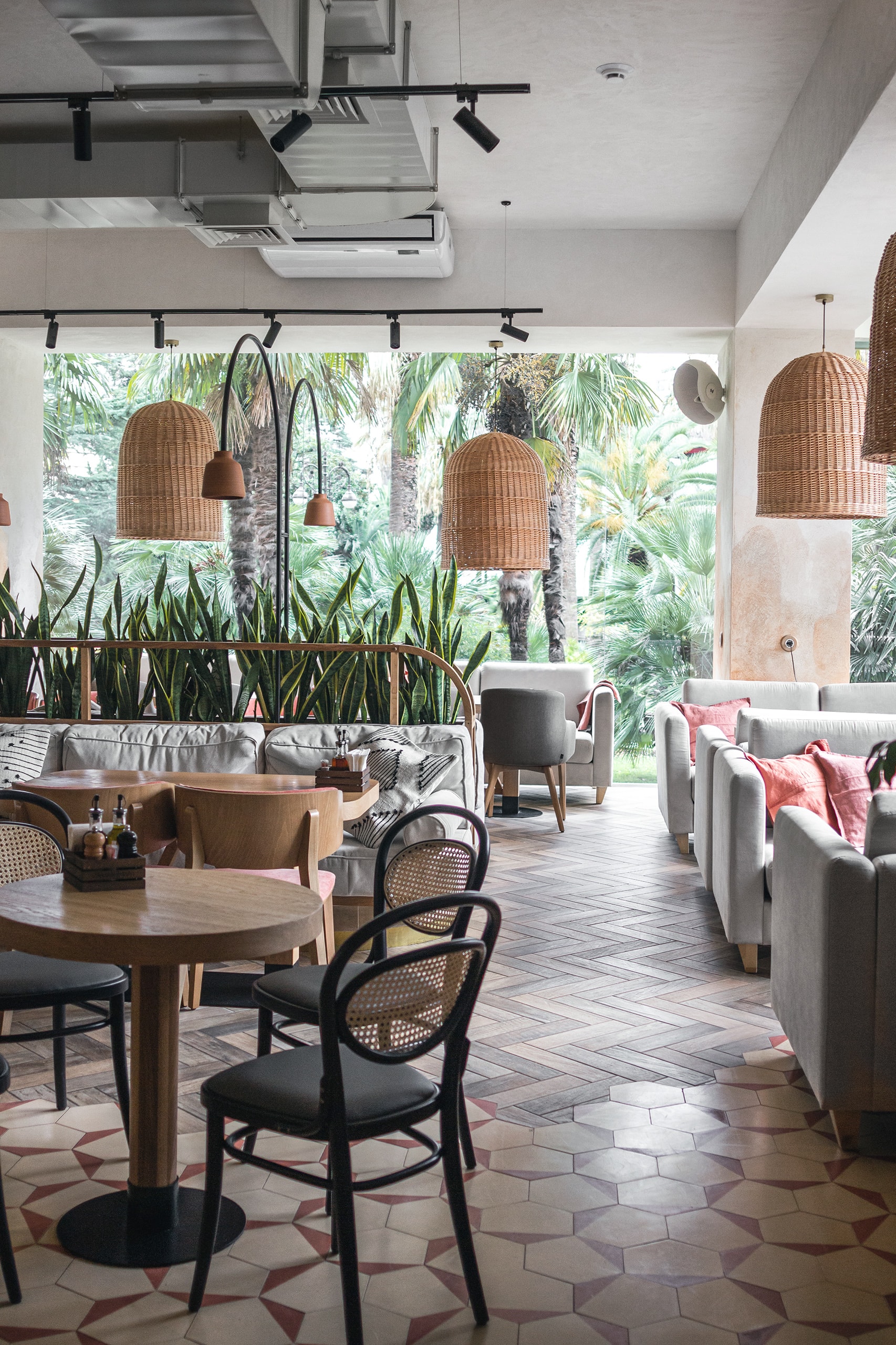
Our team was invited to take part in decoration of the Italian Mama Roma Restaurant with a 20-years’ history. The first restaurant of this network was opened in St. Petersburg in 1998, and they still serve pizza from a wood-stove, wine, and Italian gourmet items there.
Our facility was a lounge of 150 m2, located in the center of Sochi, a city in the south of Russia, and this conditioned some of the design decisions made.
We had to transform a former Mango clothes shop to a cozy restaurant in the heart of a modern resort. The all-glass façade of the restaurant overlooks the promenade that leads to the sea. In immediate proximity to the restaurant, there are palm trees and sub-tropical shrubs.
Planning solutions
The space of the restaurant was divided into three parlors. The first one at the entrance resembles a bistro with its bentwood chairs; the second has a massive table for big companies and an open pizzeria where you can watch your pizza made; and the third contains a large island sofa and an open kitchen.
Finishing solutions
After a discussion, we decided to be consistent with the brand interior design, and yet make our restaurant up-to-date and find some modern formats for traditional methods.
The previous tenant left us polished limestone floors, and we thought it was a good idea to use some of them in our new interior.
Limestone and plaster were complemented with cement tiles and pyramid-shaped panels, as well as ceramic lamp-shades at conventionalized arch-like stands, and laconic rattan lamps. All of these were hand made by crafters at local sites in accordance with customized drawings.
All the wood pieces, including vanity units, tabletops, waiters stations, hostess stands, and display racks were made to order of solid oak wood and supplemented with bronze details. All the walls and ceilings were plastered to create a setting of a typical Italian trattoria. The fresco at the bottom of the wall didn’t appear there by chance – it protects the material from every-day wear.
We’ve designed another important functional element for this project – guided sunscreen roller blinds that can be moved along the glass panels, protecting visitors from scorching sunshine. Patterns of the panels echo shelves above the bar, the pizzeria, and the open kitchen.
Decorations of this interior keeps on the environment: spectacular setting is provided by mature olive trees in tubs, making guests feel as if they are in Italy. We placed those trees along the façade and the walls to ensure a smooth inside-outside transition. The theme of trees was supported with hanging flower baskets and vases with tallow tree branches on the tables.
AP15
RC FAMILIA
-
Square
94.9 sq.m
-
Design team:
Dmitry Dubrovsky
-
Client:
private individual
-
Location:
Saint-Petersburg, RC Familia
-
Type:
Apartment
-
Design:
2022
-
Construction:
2022-2023
-
3D-visual:
Vyacheslav Korchagin
-
Square
94.9 sq.m
-
Design team:
Dmitry Dubrovsky
-
Client:
private individual
-
Location:
Saint-Petersburg, RC Familia
-
Type:
Apartment
-
Design:
2022
-
Construction:
2022-2023
-
3D-visual:
Vyacheslav Korchagin
The owners, a young couple with two small children, chose to buy an apartment in a new residential estate on Petrovsky Island in Saint-Petersburg. They came to us with precise ideas about how their house should look like. The concept of this interior was agreed upon from the very first time.
In the work on the project we always start from the context, architecture of the building or the surroundings, which is how we determine the starting points for the design. The apartments are located in a modern estate with sand-coloured facades, graphite accents, slender panoramic windows, and generous terraces.
In the scheme chosen for the finishes, we used a delicate mix of natural materials and a light organic color palette from pearl gray to light olive shades. The interior space is solved by large planes, rhythms, volumes and filled with light, but each room has its own dominant feature. In the living room is a dining group with graphic pendant lamp Vibia Flat, in children - unusual arched headboards, in the bedroom - slatted panel, passing from the bed base to the window-sill structure.
We have tried to create a cozy and laconic interior, clean, clear, and easy to use, consistently evolving from the entrance.
In the apartment, we identified three large functional blocks: the common area, a block of master bedroom with dressing room and a block of kidsroom adjacent to the playroom. They are all connected by a corridor, the area of which we tried to reduce as much as possible. And we are greeted by a small hallway with a clearly defined "dirty" area. We also planned two bathrooms: the master bathroom with a shower and a bathtub, and a guest toilet closer to the entrance to the apartment.
Realizing that modern interiors do not forgive carelessness in detail, we carefully worked out every nook and cranny carefully and carefully. We used a "hidden" skirting board for the junction of wall and floor, a "shadow joint" for the ceiling and wall, installed doors with a hidden frame and used built-in lighting systems of different types. For custom-made cabinet furniture, we "released" the side walls to the thickness of the facades and supported them with a slat panel with broken rhythm. We and.
So we got a precise architectural interior, where everything is built on composition: rhyme, stain and line.
O1
DUGA STUDIO
-
Square
35.0 sq.m
-
Design team:
Dmitry Dubrovsky, Sergey Ugarov, Dmitry Kashemirov
-
Client:
Duga Studio
-
Location:
Karpovka River Emb. 5, b.22, office 206, Saint-Petersburg, Russia
-
Type:
Offices
-
Design:
2019
-
Construction:
2019
-
Photo:
Daniil Zherdev
-
Style:
Kseniia Valdman
-
Square
35.0 sq.m
-
Design team:
Dmitry Dubrovsky, Sergey Ugarov, Dmitry Kashemirov
-
Client:
Duga Studio
-
Location:
Karpovka River Emb. 5, b.22, office 206, Saint-Petersburg, Russia
-
Type:
Offices
-
Design:
2019
-
Construction:
2019
-
Photo:
Daniil Zherdev
-
Style:
Kseniia Valdman
Facility
We designed this office studio for ourselves. It is located in one of the blocks of the LenPoligrafMash Tech Park in St. Petersburg. It is a place with a history: a former plant at the
Petrogradskaya Side was moved to the Primorksy district, and at the vacant premises, a cluster was established where technological and creative subjects are found side by side, complementing each other.
We’ve set up a studio in Block 22, which also houses the Fashion Space bringing together fashion designers, and IT companies like Bolshoy Musey (BM.digital) of Yandex Publisher.
Planning solutions
The square in plan space was divided in two halves with a suspended mobile drapery. Thus, we created two functional zones that can be either separated or united: a zone for meeting visitors and guests (the meeting room), and a working space.
We also managed to find little space for our leisure: at the window, we put a comfortable armchair and a metal rack with design and architecture books, as well as a record player with a humble collection of vinyl discs.
Finishing solutions
The interior features a restrained style typical for Scandinavian countries. We tried to make it homely comfortable through the use of a soothing palette and a focus on natural materials, making this place supportive of thoughtful work instead of distraction.
We concealed power and low-voltage networks in grey polypropylene tubes, and painted existing ventilation ducts and heaters black. Thus, a certain graphic pattern was arranged in the office. In the meeting zone, this graphics was supported with black and white photos, as well as printed graphic images we brought along from our journeys. In the working zone, the preset rhythm was supported by shelves displaying our findings from jumble sales and radiating pleasant memories. Thanks to these pieces and photos, the interior became more lived-in and
unique.
AP101
RC SKANDI KLUBB
-
Square
78.6 sq.m
-
Design team:
Dmitry Dubrovsky
-
Client:
private individual
-
Location:
Saint-Petersburg, RC Skandi Klubb
-
Type:
Apartment
-
Design:
2019
-
Construction:
2020
-
3D-visual:
Vyacheslav Korchagin
-
Square
78.6 sq.m
-
Design team:
Dmitry Dubrovsky
-
Client:
private individual
-
Location:
Saint-Petersburg, RC Skandi Klubb
-
Type:
Apartment
-
Design:
2019
-
Construction:
2020
-
3D-visual:
Vyacheslav Korchagin
Facility
An apartment of about 80 m2 is located in Aptekarsky Prospect of the Petrogradskaya Side, in the Skandi Klubb Residential Estate. The project was made for a married couple that were relocated to St. Petersburg from Moscow for job.
The residential estate features a Scandinavian style, its facades plastered and painted neutral grey and complimented with bright burgundy highlights. We adhered to a similar color pallet in our design.
Planning solutions
Our key planning challenge was to design a spacious multifunctional zone for leisure and house partying, as well as an independent living zone with a bedroom, a bathroom, and a kids’ room. We decided to unite a kitchen, a diner, and a sitting room into an open space, which is typical for Scandinavian countries, and separate living premises from it with a small hall.
In the kitchen, the island has the dominant part, housing a breakfast stand and being adjoined by a dining place. Moreover, it has a built-in wine chiller, facing the kitchen. This solution supported visual integrity of the area.
The same zone was used to locate a sofa and a TV cabinet, in which the owners of the place store their collection of vinyl discs. This zone was separated with a planked partition in a metal frame, which also concealed the guest bathroom on the side of the corridor.
Finishing solutions
As to the stylistics, we wanted to design an urban housing interior which with its austerity and modesty would be different from the relaxed atmosphere of the customers’ Moscow-based home. At the same time, we wanted to fill the apartment with air and natural light, and to make all the storage systems and secondary rooms kind of transparent and hard to notice. The neutral background was complimented with terracotta and burgundy hues, repeating the pallet of external facades.
In this interior, we used furniture and object design pieces by Scandinavian manufacturers: &tradition, Muuto, Normann Copenhagen, and others.
H3
BLANK SPACE CLINIC
-
Square
98.2 sq.m
-
Design team:
Dmitry Dubrovsky, Olga Litvinova
-
Client:
private individual
-
Location:
Saint-Petersburg, Parfenovskaya Str.
-
Type:
dental clinic
-
Design:
2020
-
Construction:
2021
-
3D-visual
Dmitry Dubrovsky
-
Square
98.2 sq.m
-
Design team:
Dmitry Dubrovsky, Olga Litvinova
-
Client:
private individual
-
Location:
Saint-Petersburg, Parfenovskaya Str.
-
Type:
dental clinic
-
Design:
2020
-
Construction:
2021
-
3D-visual
Dmitry Dubrovsky
The client came to our studio to design the interior of a dental clinic.
It is a small clinic, perhaps the smallest in all the time of our practice.
Therefore, all decisions were aimed at maintaining a sense of airiness in a small volume and working with textures, color and lighting. For the backgrounds, we chose a shade of off-white, close to pure white. For the accent sections of the walls, the panels were milled in the same shade with a rhythmic pattern. Only the openings leading to the different functional areas were highlighted by framing in acrylic stone of a darker shade.
The lighting scenarios for the interior of this clinic are on two levels: ceiling and wall-mounted types of lighting. For the ceiling solutions, we used track lighting fixtures of various shapes, with fill and directional light sources from centrsvet. For the wall solutions, we used plaster fixtures imitating the bent plane of a part of the wall.
Filling the corridors and waiting area with diffused light, we achieved this with ceiling panels filled with fine grid and linear downlights with diffusion profiles behind them.
In this interior, we also paid special attention to creating an abutting junction.
For the floor-wall junction we used a hidden skirting board, and for the ceiling junction we used a special aluminum profile to get a "shadow gap".
And if we talk about style in general, we would describe it as minimalism, which we defined by the use of a minimum of expressive means.
AP51
RC GALAXY
-
Square
75.3 sq.m
-
Design team:
Dmitry Dubrovsky
-
Client:
private individual
-
Location:
Saint-Petersburg, RC Galaxy
-
Type:
Apartment
-
Design:
2019
-
Construction:
2020
-
3D-visual:
Vyacheslav Korchagin
-
Square
75.3 sq.m
-
Design team:
Dmitry Dubrovsky
-
Client:
private individual
-
Location:
Saint-Petersburg, RC Galaxy
-
Type:
Apartment
-
Design:
2019
-
Construction:
2020
-
3D-visual:
Vyacheslav Korchagin
Facility
Design of this apartment was ordered by a young couple – he is an interface designer, and she is a game designer. The apartment is located in the center of St. Petersburg, in the new Galaxy Residential Estate, at Parfyonovskaya Street, not far from the Frunzenskaya Metro Station.
To follow our principle of keeping up with the architectural context, together with the customers we decided that the interior was to be modern, warm, and youthfully vigorous.
Planning solutions
The apartment was divided into three zones: an entrance lobby with a bathroom, an open kitchen/diner/sitting room, and a bedroom with a walk-in wardrobe.
On the way from the entrance lobby to the kitchen, we designed a storage zone with an integrated laundry place, smoothly transiting into the facades of the kitchen shelf, holding built-in kitchen appliances.
In the sitting room, we installed a corner sofa in front of a TV cabinet and a book rack. A similar rack was installed in the bedroom, echoing it with a light transparent partition between the bedroom and the walk-in wardrobe.
Finishing solutions
To ensure accordance of materials, we chose a combination of dusty pink terrazzo tiling with bronze riffled glass and oak wood, which was used not only as flooring, but in kitchen facades, and vertical guides of the racks both in the sitting room and the bedroom, as well as in free-standing furniture pieces. In the bathroom, we inverted our pallet and used black terrazzo tiles in combination with handmade dusty pink tiles and a riffled glass barrier in a black welded frame.
H2
ANJERS DENTAL
-
Square
194.5 sq.m
-
Design team:
Dmitry Dubrovsky
-
Client:
Anjers Dental
-
Location:
Korpusnaya Str. 3, Saint-Petersburg, Russia
-
Type:
Healthcare, Dental Clinic
-
Design:
2019
-
Construction:
2019
-
3D-visual:
Dmitry Dubrovsky
-
Identics:
Kseniia Valdman
-
Square
194.5 sq.m
-
Design team:
Dmitry Dubrovsky
-
Client:
Anjers Dental
-
Location:
Korpusnaya Str. 3, Saint-Petersburg, Russia
-
Type:
Healthcare, Dental Clinic
-
Design:
2019
-
Construction:
2019
-
3D-visual:
Dmitry Dubrovsky
-
Identics:
Kseniia Valdman
Facility
The premises of the future dental clinic are located in the Mendelson Residential Estate at the Petrogradskaya Side, not far from the Krasnoe Znamya Fabric.
The Mendelson House got its name from Erich Mendelson, a famous German architect who had designed a near-by powerhouse for the fabric built in the early 20th century. It is a listed monument of avant-garde architecture. Architectural solutions of the Mendelson House were inspired by constructivism, where functionality dictates simple solutions and hence geometrical austerity and rhythmical recurrence of lines. The volumetric-spatial solution is laconic and matches the near-by listed building.
Planning solutions
When working on the interiors of the dental clinic to-be, we followed the same principles: simple solutions, a connection to the historical context and environment, as well as compliance with standards and rules established for healthcare facilities.
The room has two entrances, which facilitated separation of two flows – doctors and patients. Medical rooms are located along the lighting front of the façade, and thus are filled with natural light. Moreover, we added some daylight to the corridor – a system of transom windows and glass doors made it look more spacious.
Finishing solutions
In finishing, we supported exterior appearance of the building, finding inspiration in tectonics of the power station at the Krasnoe Znamya Fabric. That was how our design got its rounded shapes with horizontal division: it helped to harmonize vertically extended proportions and add a functional border at the wall bottom to safeguard the surface from rapid wear.
To lighten the premises, we used built-in disk lamps, similar in shape to the windows on the facades of the residential complex. To produce a soft lighting effect and make our interior look
more relaxing, which is more typical for a SPA, we preferred to ceiling lamps some sconces with diffused warm light and integrated linear wall lamps at the ankle level.
The ceiling is made of oak veneered aluminum planks, which were used to hide all the engineering equipment. Thus, all the service stuff remained unseen for the visitors, with only the essential functions at the surface.
O3
KYD
-
Square
37.0 sq.m
-
Design team:
Dmitry Dubrovsky
-
Client:
KYD BURO
-
Location:
Obvodny Kanal Emb. 199-201, Saint-Petersburg, Russia
-
Type:
Offices
-
Design:
2015
-
Construction:
2015
-
Retouch
Sergey Brezhnev
-
Square
37.0 sq.m
-
Design team:
Dmitry Dubrovsky
-
Client:
KYD BURO
-
Location:
Obvodny Kanal Emb. 199-201, Saint-Petersburg, Russia
-
Type:
Offices
-
Design:
2015
-
Construction:
2015
-
Retouch
Sergey Brezhnev
Facility
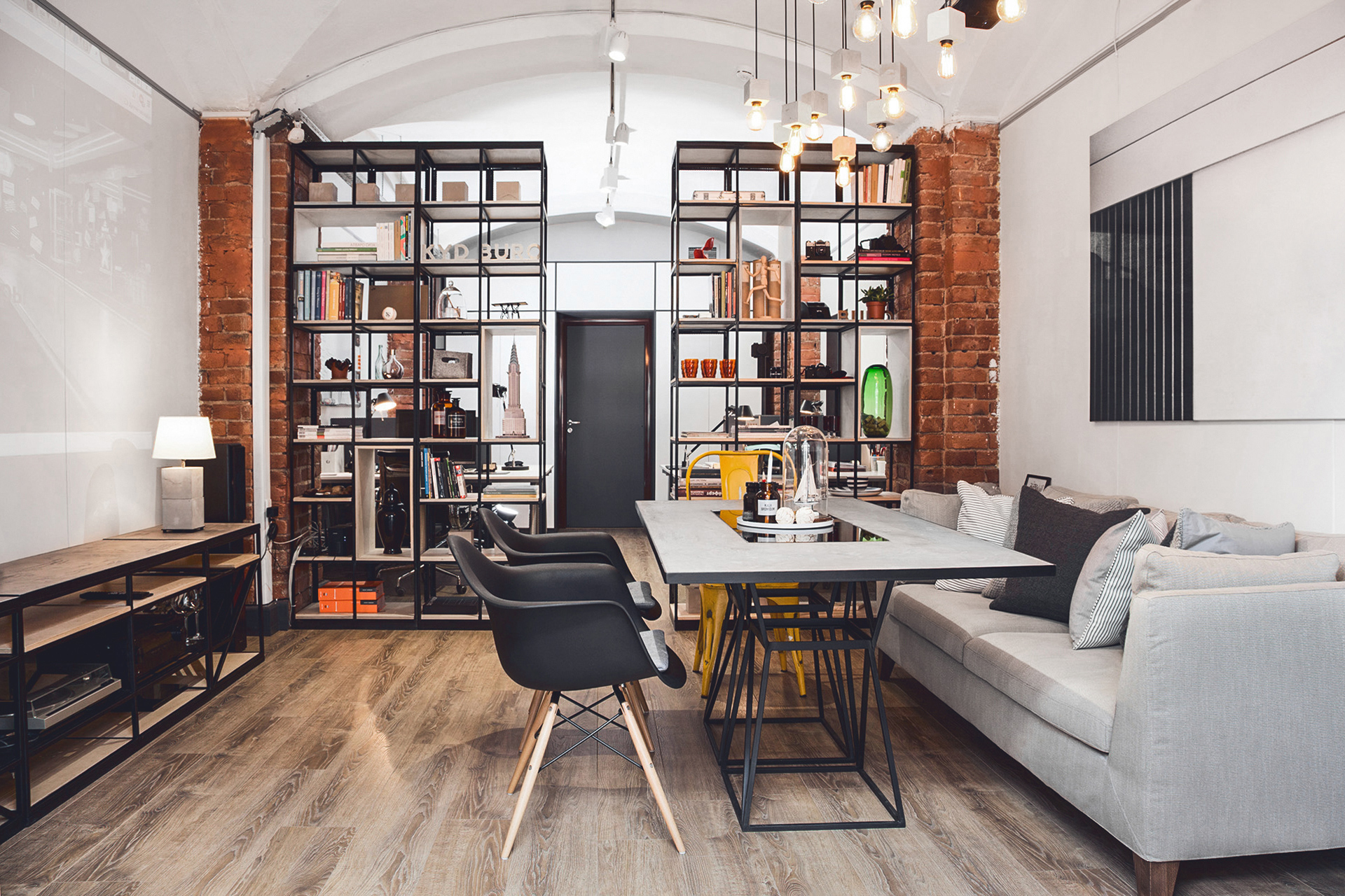
As our studio kept expanding, by 2015 we realized that it was time to choose a bigger place.
During our search, we fortuned upon a group of buildings at the Obvodny Channel with fascinating history. Some of the premises used to be wine cellars, and now they became a business center. We thought it was a good place for us to stay.
Dividing a long room into two functional spaces – the guest area and the work zone – made sense, so we fit two racks into the brick columns supporting the cross-arching vault, approximately in the middle of the room.
It was decided to conceal power cables and low-voltage networks, and for that we ordered special floor skirtings with cable channels. Later, we hid all the electrical fittings there, thus leaving the walls and partitions harmless and saving other tenants the trouble.
Interior solutions
On our own, we designed basic furniture and had it made to order of three materials: plywood, metal, and microcement.
Every furniture piece was based on a precise geometric structure: the meeting table was a golden rectangular, whereas racks and the credenza for audio-visual equipment were based on a modular grid with 30 by 30 centimeters cells. Plywood surfaces were made with an CNC mill and treated with furniture varnish. Surfaces of the table and the credenza were treated with microcement.
The lighting scheme of the meeting room was also based on a modular grid, yet a smaller and a less structured one. We designed a retro-style light installation with Edison light bulbs and cubiform concrete lamp bases.
The racks housed our rich collection of design and architecture books. To brighten the space up, we used our photos and pieces collected throughout our lives. The resulting interior keeps our memories and features bright moments in details.